MediGo Fertility
Website Design
“Wow, this website has provided easy-to-understand information about contraceptives.”
- MediGo Developer
Academy Xi Group Project with live client
Role: UX/UI Designer
Responsibility: Wireframe, prototype, user testing, pitch to client & a team player
Timeframe: 6 weeks, February 2023
Tools: Figma, FigJam, Zoom
Our primary objective was to develop an
easy-to-understand, educational website which showcases informational content relating to reproductive health, in particular contraception
And the secondary objective was to understand how men want to be engaged with, in regard to fertility and contraception.
What does the research tell us?
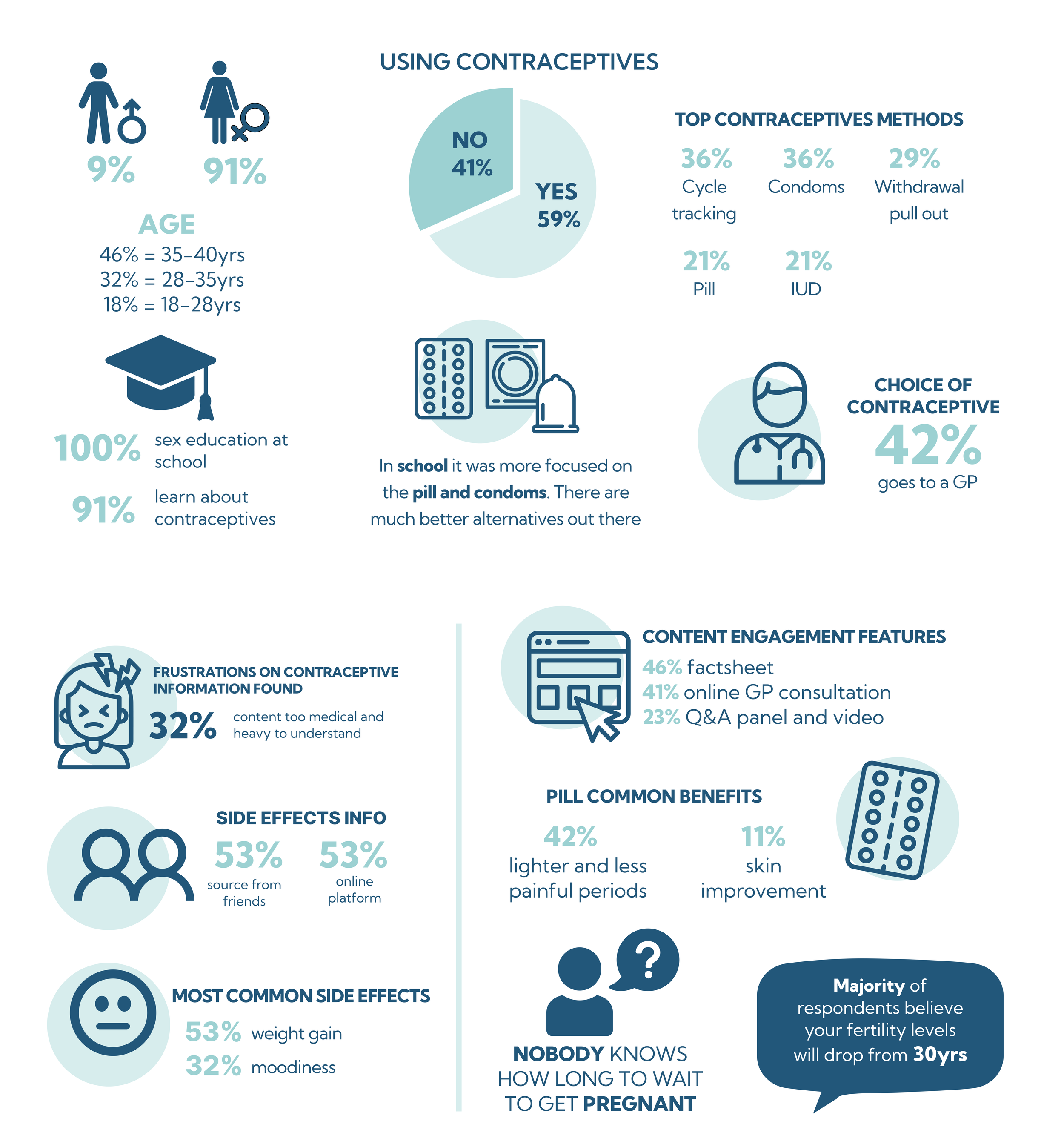
“Women feel frustrated with the lack of holistic information about contraceptives and the “one-size-fits-all” approach by many GPs. From our research findings a secondary statement emerged, which is: “Men feel detached from the contraception and fertility dialogue, and lack a supportive space for learning and discussion, especially with other men. The findings and opportunities to explore were categorised in the below.
-
I prepared a research survey which I planned to email to donors. I obtained a registered donor list from the Anglicare Fundraising team. I Consulted with the head of fundraising who suggested I call the donors as this was a softer and friendlier approach. I spoke to 10 donors who completed the survey and this is some of what they said.
-
I conducted desktop research looking at similar industry groups that have donation functions as part of their experience. I did this to gain a deeper understanding of the community fundraising space from a functional practical and usability perspective. I noticed some good examples of customer testimonials through images and stories that connected with donors and encourages further interaction.
-
The purpose of the 1on1 interview with the GM Community Fundraising was to share and understand some of the Salvos recent experience with donor engagement specially during recent COVID restrictions. This really helped me discover opportunities for Toys'n'Tucker community approach through Facebook and technology. By introducing QR code and utilise Facebook campaigns for border engagement and data tracking.
-
Item description
Snapshot of key findings
Content format
Restores users confidence, through interactive tools such as videos, online quizzes and testimonials
Barriers with men
Create content tailored to encourage and support men on their road to fatherhood
Benefits of contraception
Centralised easy to understand content information on side-effects
Side effects of contraception
A step by step guide on alternative contraceptive methods to educate and support
Two way communication
Encourage GPs on the platform to expand their discussions on contraceptive options
Desired features
Q&A panel and virtue online appointment - adding a personalisation or anonymous feature
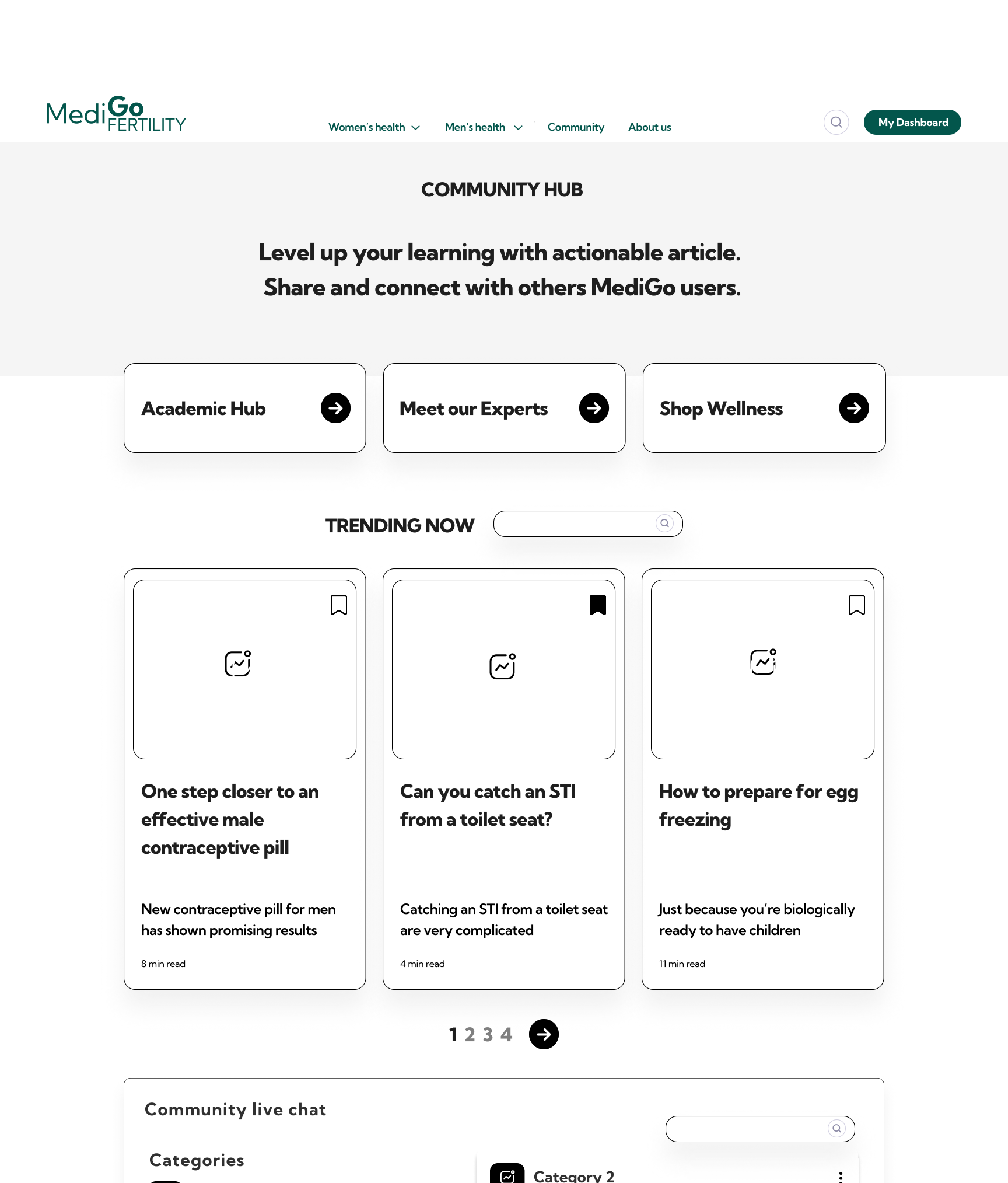
Let’s do some wireframing
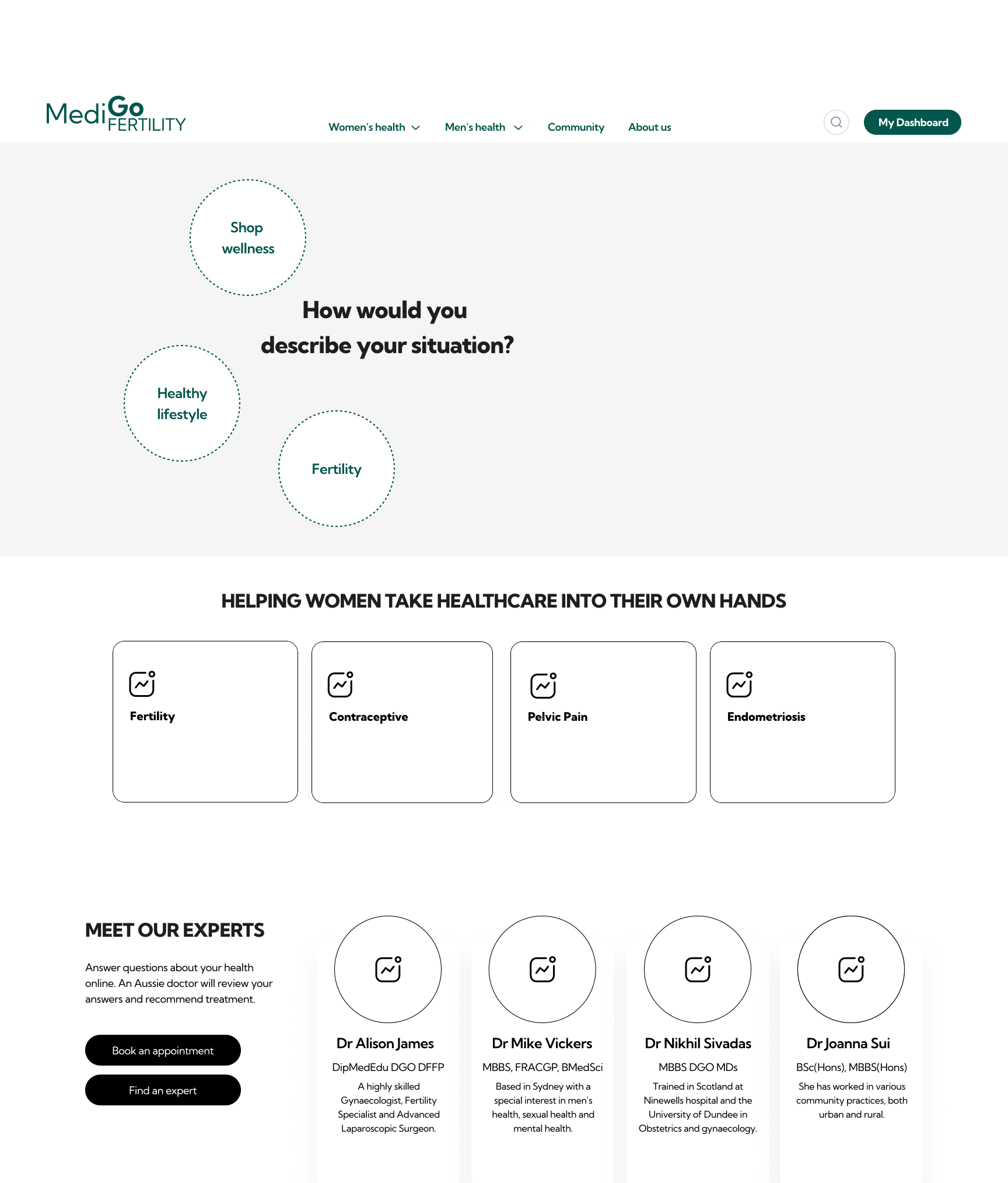
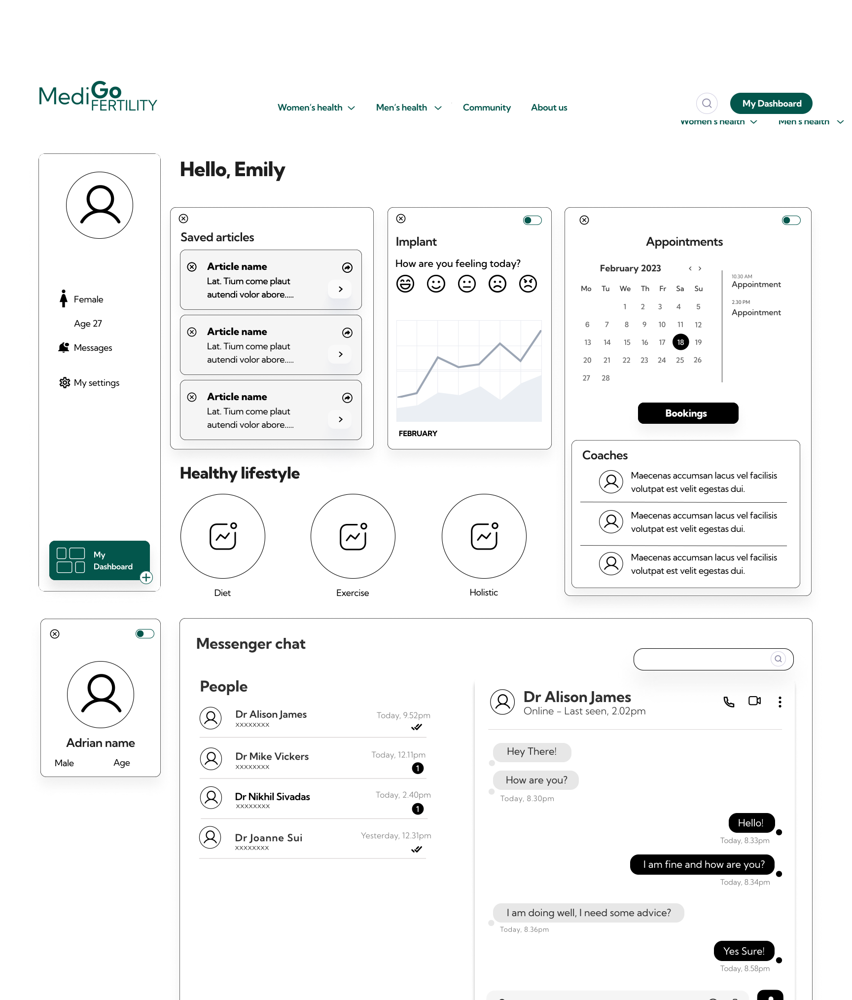
Emily sets up her dashboard through her My dashboard button, through this function you can see Emily has selected: She connects her partner Adrian and allows him to view /access her symptom tracker and appointments. This function allows for interaction and support between partners. You can see in the dashboard booking can be made directly with dr / health expects, as well as online chat
User flow - Dashboard
-
Individual widgets and sharing toggle with others on the dashboard, feels easy to engage with
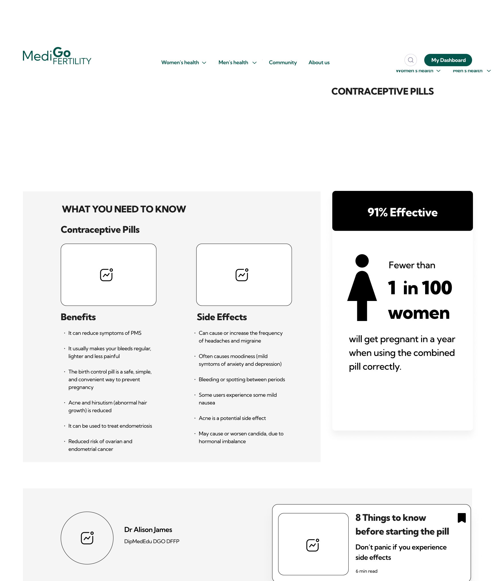
Love the animated graphics in bite size content, easy to read and understand. Perhaps slowing it down a few seconds
-
Not clear on what the home banner means. It didn't suggest this website is tailored for men as well
The navigation to go back and see all contraceptive options seems difficult and hidden in the top navigation bar
-
Build on the My Dashboard feature, further refining the sharing and archiving functions
There is an opportunity in phase 2 to develop the dashboard feature, allowing for all content across the platform to be saved and shared
Grow male content to further support men to be better partners and encourage them to engage with the MediGo Fertility community


